Quick Guide
- Why Is Everyone Suddenly Loving Lilac Green?
- The Psychology Behind the Calm
- How to Use Lilac Green in Your Home (Without It Looking Dated)
- What Colors Go With Lilac Green? (The Good, The Great, and The Unexpected)
- Top Paint Brands and Their Lilac Green Stars
- Lilac Green in Different Design Styles
- Answering Your Lilac Green Questions (FAQ)
- A Few Cautions (Keeping It Real)
You know that feeling when you walk into a room and just... breathe? Everything feels lighter, softer, like the air itself is easier to take in. That's the magic a really good color can do. And lately, I can't stop thinking about one color in particular that seems to nail that vibe perfectly: lilac green.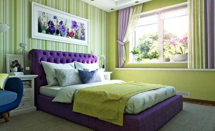
It's not sage, it's definitely not mint, and it's miles away from olive. Lilac green sits in this beautiful, hazy middle ground. Imagine the first tender leaves of spring, but washed with the faintest whisper of a lavender-gray dusk. It's soft, it's sophisticated, and honestly, it's a bit of a chameleon. Under bright light, the green notes pop, feeling fresh and botanical. In softer, warmer light, those subtle lilac or gray undertones come forward, creating a cocoon-like serenity. I first saw it on a kitchen island in a friend's renovated cottage and spent the whole dinner trying to figure out what the color was instead of paying attention to the conversation.
So what exactly is lilac green? At its core, it's a muted, medium-toned green with a significant gray base and a hint of purple or violet (the "lilac" part). This combo of green (calming, natural) and subtle purple (creative, spiritual) tones down the vibrancy of a pure green, landing you with a color that's deeply restful but never dull. It's nature-inspired but with a curated, almost poetic feel.
Why Is Everyone Suddenly Loving Lilac Green?
It's not just a pretty face. This trend connects to bigger shifts in how we want our homes to feel. After years of stark whites and cool grays, there's a massive pull toward warmth, comfort, and connection to the natural world. But we've also gotten smarter about it. We don't just want "green"; we want nuance, complexity, colors that change with the time of day and don't scream for attention.
Lilac green delivers that. It's a background color that acts like a warm hug for your other decor. It makes wood tones look richer, makes textiles feel cozier, and somehow makes art on the walls stand out more. I think the rise of lilac green paint specifically is a reaction to the demand for colors that support wellbeing. It's hard to feel anxious in a room painted this color. It's like visual ASMR.
A quick personal gripe: I see some articles lumping it in with just "muted greens." That misses the point entirely. The lilac undertone is what makes it special. Without that, you're just looking at a gray-green. That subtle purple is the secret ingredient that gives it depth and keeps it from feeling cold or flat.
The Psychology Behind the Calm
Green's Natural Base
Green is universally associated with nature, growth, and restoration. It's the easiest color for the human eye to process, which is why it's inherently restful. Studies have linked exposure to green hues with reduced stress and improved concentration. When you use a lilac green color in your home, you're tapping into that deep-seated connection to the natural world. It brings the outside in, but in a refined, stylized way.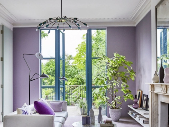
The Lilac (Purple) Influence
This is where it gets interesting. Purple, in its softer lilac forms, is linked to creativity, introspection, and a touch of spirituality. It's a contemplative color. By infusing a green with a drop of purple, you're adding a layer of calm thoughtfulness to the natural tranquility of green. It's not energizing like a yellow-green might be; it's centering. This makes it absolutely perfect for spaces where you want to unwind, think, or connect—bedrooms, studies, reading nooks, and even living rooms meant for conversation.
Is it for every single room? Maybe not a high-energy home gym. But for most living spaces, it's a contender for the perfect neutral.
How to Use Lilac Green in Your Home (Without It Looking Dated)
This is the practical stuff. You're probably thinking, "This sounds great, but how do I actually use it?" Let's break it down by room and approach.
Pro Tip Always: Get a sample pot! Paint a large swatch (at least 2x2 feet) on multiple walls in the room. Look at it in morning, noon, and evening light. The character of lilac green changes dramatically, and you need to be sure you love all its personalities.
Walls: The Full Immersion
Painting all four walls is a commitment, but it can be stunning. It works exceptionally well in rooms with good natural light. The color will feel airy and expansive. In north-facing or darker rooms, test carefully—it can lean a bit more gray and moody, which can be amazing for a cozy den but might feel too somber for a kitchen you want to feel bright.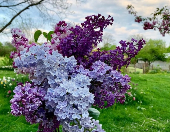
I used a lilac green paint in my home office, and it was the best decision. The previous bright white was giving me headaches. Now, the space feels focused and peaceful. The only downside? It made the other rooms in my house suddenly look less interesting.
Accent Walls & Built-Ins
A safer, but no less impactful, route. Painting a single accent wall, a bookcase, or kitchen cabinetry in lilac green adds a major dose of character without overwhelming. A lilac green accent wall behind a bed feels like a serene headboard. Painted kitchen island? Instant focal point and conversation starter.
Through Furniture & Textiles
Not ready for paint? Dip your toes in with a velvet sofa, upholstered headboard, or a set of curtains. This is a fantastic way to introduce the color. A large linen sofa in this hue becomes the anchor of a living room. Throw pillows and blankets are the easiest, lowest-commitment entry point.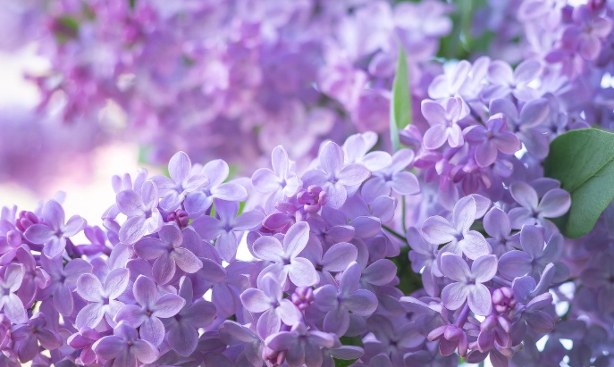
What Colors Go With Lilac Green? (The Good, The Great, and The Unexpected)
This is where lilac green decor really comes to life. Its muted, complex nature makes it incredibly versatile. It plays well with a lot of palettes.
| Color Pairing | Visual Effect & Vibe | Best Used In... |
|---|---|---|
| With Warm Whites & Creams (e.g., Benjamin Moore White Dove, Sherwin-Williams Alabaster) |
Creates a soft, airy, and timeless look. The warmth of the cream keeps the green from feeling cold. It's clean but cozy. | Trim, ceilings, adjacent rooms, curtains, large upholstery. Perfect for a whole-house flow. |
| With Rich Wood Tones (Walnut, Oak, Teak) |
The green complements the natural element of wood, while the lilac undertone makes the warm orange/brown notes in the wood sing. It feels organic and grounded. | Floors, furniture legs, tables, shelving, window frames. A classic and foolproof combination. |
| With Deeper Purples & Lavenders | A tonal, sophisticated scheme. Pairing it with a clearer lavender or a deeper mauve plays up its purple side. It's artistic and serene. | Accent pillows, artwork, a single upholstered chair, bedding. Use in moderation for a layered effect. |
| With Dusky Pink & Terracotta | Unexpected but gorgeous. The warm pink/terra cotta provides a beautiful, earthy contrast that's both modern and comforting. It's a sunset-inspired palette. | Textiles (rugs, throws), ceramic vases, decorative objects. Adds warmth and energy. |
| With Charcoal & Black | For a more dramatic, modern edge. The softness of the lilac green balances the severity of dark neutrals. It's sharp and elegant. | Lighting fixtures, picture frames, metal accents (iron, blackened steel), a dark sofa frame. |
See? It's not a one-trick pony.
Top Paint Brands and Their Lilac Green Stars
Every paint company has their own version, and the names are often poetry. Here are a few standout lilac green paint options from trusted brands. Remember, colors look different on screen, so this is a starting point for your sampler quest.
- Benjamin Moore: They're masters of complex neutrals. Check out "October Mist" (their 2022 Color of the Year, which is a quintessential gray-green with a whisper of lilac), "Sagebrush," or "Pale Smoke." Their historical collection is also a treasure trove for these kinds of hues.
- Sherwin-Williams: "Evergreen Fog" (another Color of the Year) is a hugely popular choice that lives in this family. Also look at "Comfort Gray" (it's more green than gray, I promise) and "Aleutian."
- Farrow & Ball: If you want depth and pigment, look here. "French Gray" (which is actually a green-gray), "Borrowed Light," and "Pigeon" are all iconic shades with that elusive, chameleon-like quality. They're pricey, but the finish and depth are often unmatched.
- Behr: Great budget-friendly options with excellent coverage. "Nurture Green," "Silver Feather," and "Whisper" are worth sampling.
I personally used Benjamin Moore's "October Mist" in a matte finish, and I love how it looks. My only regret? Not springing for the higher-end paint in one room just to compare. A friend used Farrow & Ball's "Pigeon" and the richness is undeniable, especially in low light.
Lilac Green in Different Design Styles
This color is surprisingly style-agnostic. It adapts to your furniture and accessories.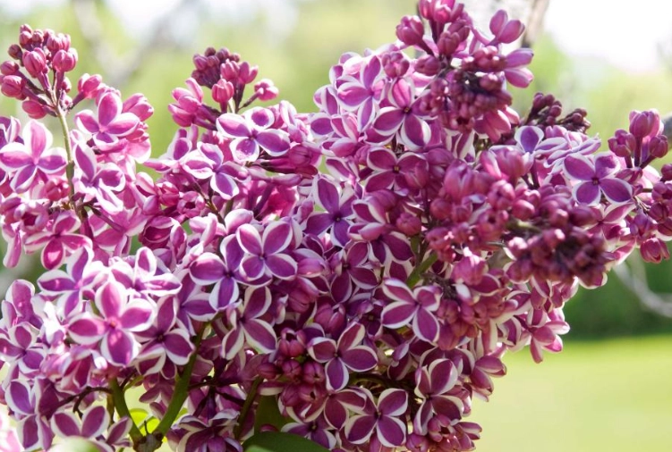
Modern Farmhouse
Swap out the cold grays for lilac green on shiplap or kitchen cabinets. Pair with oak wood, black iron accents, and lots of textured white linens. It feels fresher and more natural than the typical gray.
Japandi / Scandinavian
It's a natural fit. The muted, natural quality aligns perfectly with the Wabi-sabi and Hygge philosophies. Use it on a wall behind a light wood platform bed with simple, textured bedding. It promotes the calm, clutter-free vibe these styles are all about.
Traditional / Classic
Use it in a library or dining room. Pair with rich mahogany, brass fixtures, and classic art in gilded frames. The color feels historic and elegant, not trendy.
Bohemian
Let it be the calm backdrop for a riot of textures and patterns. A lilac green wall behind a macramé hanging, layered rugs, and plenty of plants feels grounded and intentional.
Answering Your Lilac Green Questions (FAQ)
A Few Cautions (Keeping It Real)
No color is perfect for every scenario. Here's where to be careful with lilac green:
- With Certain Wood Finishes: If you have very red-toned woods (like some cherries or mahoganies), the contrast can be stark. The green and red are complementary colors, which can vibrate if not balanced carefully with neutrals.
- In Poor Lighting: As mentioned, in a room with very little natural light, it can fall flat and look muddy or just gray. Always, always sample.
- Overdoing the Purple: If you pair it with too much bright purple, it can start to feel theme-y or juvenile. Stick to dusky, grayed-out purples or use it as a small accent.
Final Thought: The best way to think about lilac green isn't as a "color of the year" but as a modern neutral. It's a replacement for beige or gray that brings more life, calm, and character to your space. It has the same versatility but tells a more interesting story.
Choosing a color for your home is personal. It's about how it makes you feel when you walk in the door at the end of the day. For me, and for so many others discovering it, lilac green delivers a specific kind of quiet joy. It's a backdrop for a calm life. It doesn't shout; it whispers. And sometimes, that's exactly what we need our homes to do.
If you want to dive deeper into color theory and the psychological impact of hues, resources from institutions like the Pantone Color Institute or articles from design authorities like Architectural Digest can provide great foundational knowledge. For the most accurate view of specific paint colors, always refer directly to the Benjamin Moore or Sherwin-Williams websites for their official color swatches and details.
So, what do you think? Is a little bit of lilac green calling your name?
Reader Comments